Re-building a national treasure
The Irish National Lottery is played yearly by 84% of the adult population. Despite its popularity, and the hyper-growth of online gambling, the Lotto has struggled to evolve its business from in-store sales to online play. I lead the product design on an ambitious project to redesign every aspect of the lotto’s online experience in a mere 6 months. I was responsible for a team of three designers, made trickier when the onset of COVID-19 forced our team to transition to fully remote work only one week in.
The impact:
153,000+ new online player accounts registered in the first year following the redesign.
66% increase in digital channel share, growing from 9% to ~15% of total sales.
€175M+ in digital revenue generated, outstripping predicted growth trajectories.
Agreeing on the goal posts
The scale of this project was immense, touching every part of the Lottery’s business. With a tight timeline and many stakeholders, creating early alignment was crucial to the success of the project. I conducted 14 stakeholder interviews to help me understand every team’s business challenges and expectations for the project. I then worked with the product team to define success, creating a project fundamentals document I shared with the wider team.
Success metrics defined in a workshop I ran with stakeholders
Finding meaning in reams of research
The discovery phase was a high-intensity effort that allowed us to audit the existing work, review the competitor landscape, and explore the huge amount of research the National Lottery has amassed. Key insights from this research included:
Users felt the overall experience of playing online was lacking “buzz” and excitement
There were low levels of trust in the site - users had never heard of winners using the online platform and felt the language on outcome screens was vague and untrustworthy
Users had little to no awareness of the Good Causes the Lotto funded and it greatly improved their perception when told
Affinity mapping helped me sift through the research and develop a set of 8 design principles, core values the site should uphold for both the user and the brand. This drove further team alignment and was invaluable during decision stalemates.
Design Principles I defined following my affinity mapping exercise
Getting the experience right
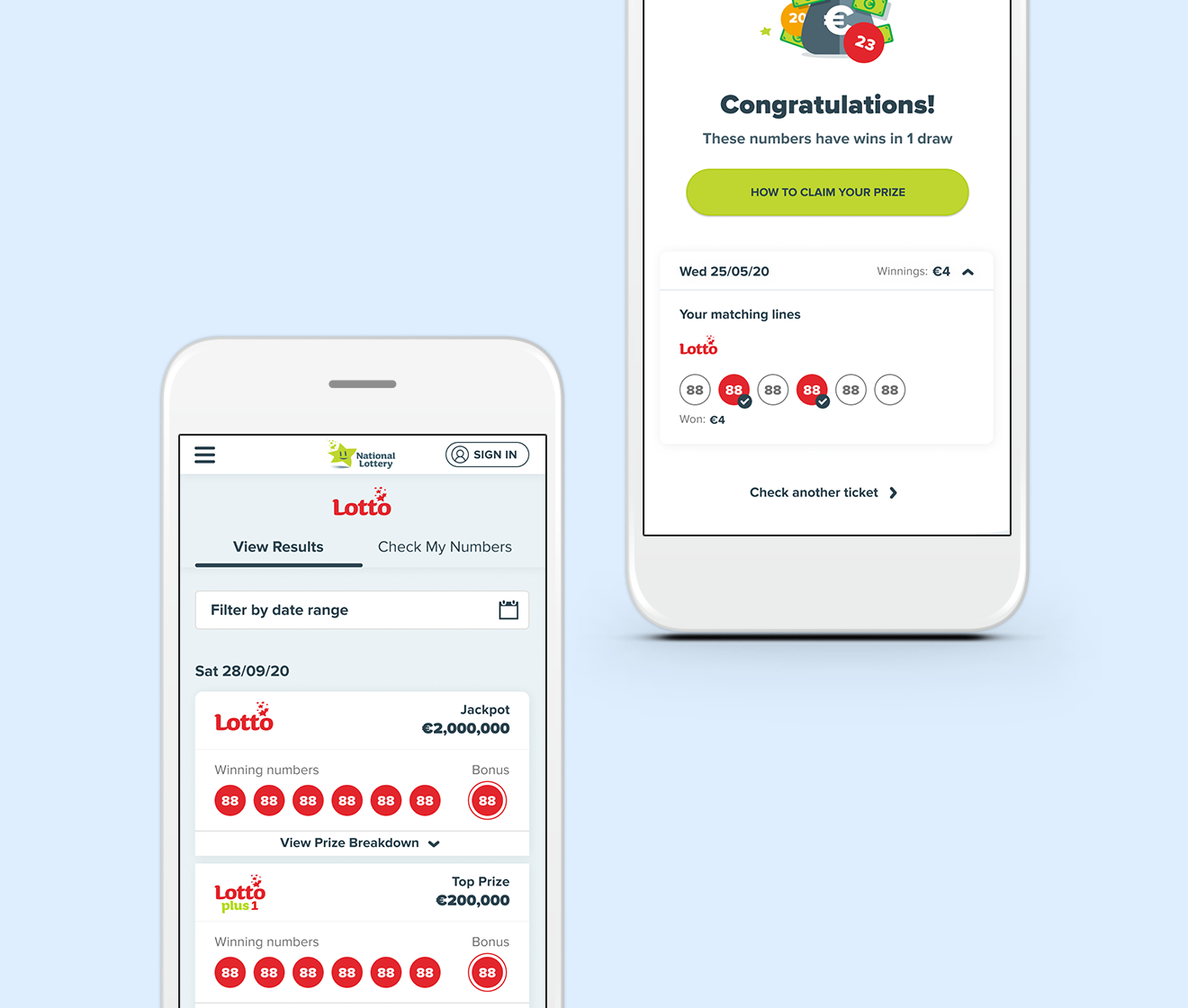
The project consisted of 12 sprints, each one beginning with a technical discovery session, where we scoped the system requirements, refined flows, and mapped out edge cases. For the purposes of this case study, I will explore the Results Checking sprint in detail.
Results Checking was the most common user journey, encompassing 78% of all site traffic, our key goals for this journey were:
Simply the experience - decrease cognitive load and limit navigational steps
Drive registration - convert results checking in-store players to online players
We started by simplifying the layout. The primary user goal (viewing winning numbers) was well below the fold so we looked at ways to conserve space whilst maintaining critical functionality. We then explored the hierarchy of information, what should be displayed and what information could be controlled via a dropdown. Users had described the results pages as “messy” and “complicated”, often missing key elements such as the raffle number. It was imperative we highlighted key information, removed clutter, and ensured tables were mobile responsive.
Simplifying the layout allowed us to draw user focus to registration messaging. After each draw we alternated between a registration banner that focused on the benefits of online play - such as never losing a ticket and automatic win notifications - and, online game play banners that focused on FOMO messaging.
Date picker and dropdown design
Building Trust
Building trust in the National Lottery’s online experience was a threefold effort. First, we earned the user’s trust by eliminating frustrations. Secondly, we built an emotional connection through surprise, delight and amplifying the positive. Lastly, we left trust cues throughout the site in the form of online winner announcements.
We saw an opportunity to build an emotional connection through the outcome screens when users scan or input their tickets. We devised win tiers based on prize value and designed an animated gif for each one, using celebratory language and giving clear direction to prize claim details. On the losing outcome screen we amplified the positive aspects by focusing on the money they were raising for community causes, rather than the loss.
User testing revealed an interesting area that we needed to build trust. Results on the outcome screens appeared near instantly and users questioned the accuracy of these results due to the rapid speed. I designed and added a loading screen, which we slowed down further on subsequent testing. This loading screen gave us a prime opportunity to further build connection and positivity by adding Good Causes messaging.
New ways of working
The combination of the looming deadline, large team and aggressive scope produced many coordination and time challenges. Managing feedback proved challenging and took up a disproportionate amount of time. To mitigate this I introduced ‘maker time’ and ‘meeting time’ to ensure my team could have adequate stretches of uninterrupted time.
Permanently working from home during this project was also a big learning curve when running workshops. The templates I set up in Miro for research, discovery and workshops proved so successful they are now being used by my colleagues across all agency projects.
User flow framework I designed in Miro
Key audience framework I designed in Miro