Ireland’s first digital retirement solution
Global bank KBC were looking to expand their Irish offering by entering the pensions and retirement market. Their point of differentiation was to offer their customers full self-service capability for post-retirement products, a proposition unique in the Irish market, and one which would allow customers to have better oversight and understanding of their financial future. As the UX lead, I steered this initiative from a blue sky concept into a robust, regulatory compliant experience.
The Impact
The new digital-first framework contributed to a 30% increase in customer conversion rates across the platform.
Facing a significant compliance roadblock I pivoted 80% of my consumer-facing design patterns into the internal advisor-facing tool, saving months of rework and development time.
Setting the design direction
Having little knowledge of post-retirement products (ARFs and AMRFs), I needed to understand them thoroughly and quickly. I organised a deep dive with the KBC team to map out product fundamentals, review regulatory constraints, and begin research into user needs, behaviours and pain-points.
Our research revealed that not only did potential customers have limited understanding of retirement products, they actively chose to engage with them as little as possible. When asked why, they answered: “Because it’s very complicated, it overwhelms me” and “Because I don’t know anything about investments”. This often led to negative outcomes and financial vulnerability down the line.
Three primary questions informed my design strategy:
Taking the fear out of the unknown
To turn post-retirement products into something less daunting and more familiar, education would be key. Clearly explaining the product, the process, and the outcomes of actions would build trust and familiarity, and hopefully lead to better financial outcomes for our users. I achieved this by:
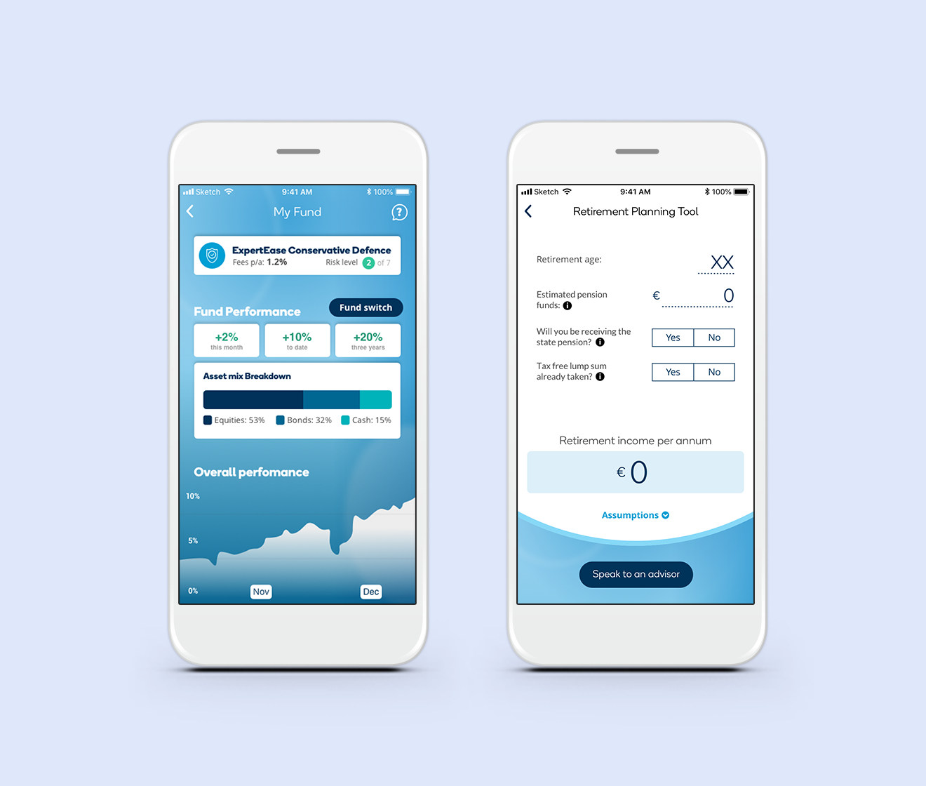
Ensuring an education hub was within quick reach on every single screen. The education hub had easy to understand content such as FAQs and videos, as well as quick access to chat or phone services with KBC’s contact centre team.
I conducted extensive user testing to ensure the labelling of steps were clear and, above all, used familiar language. Speaking the users’ language makes the interface easier to learn and remember, building an experience that feels intuitive.
Clear and prominent impact statements were designed for every action screen. Before a user confirmed any change to their funds, they were informed of the consequences to the projected date their funds would run out. This allowed users to tweak their actions to minimise potentially negative outcomes.
Help screen with Education Hub and Retirement Planning Tool
Digital ambition meets regulatory reality
KBC has a legal obligation to ensure that their retirement products are the best solution for each individual’s circumstances. I proposed many solutions to accommodate this in the onboarding flow - learning modules, screening questions, up front user liability acceptance - no matter the solution Legal would insist that it didn’t cover the obligation. Finally they insisted that a financial advisor make a tele-assessment at two seperate intervention points in the flow, blowing out the onboarding timeline to a 2-3 week process.
At this point I decided to rethink the experience completely, instead recommending onboarding occur solely with an advisor and the digital experience be a simple appointment booking system with document upload. Whilst this was a disappointing outcome, I don’t believe a journey should be made semi-digital at the expense of a simpler, friction-less route.
Thankfully my original onboarding screens didn’t go to waste as I adapted them into a customer onboarding system for financial advisors, which my PM partner pitched internally, and was subsequently green lit as a new project.
Onboarding task flow with advisor interventions
Hi-fidelity wireframes of the different solutions designed for Legal concerns - upfront consent, learning module, and screening questions.
Designed for confidence
For the self-servicing flow to be successful it needed to inspire confidence in customers to take full control of their financial future. I designed the main screen to give a clear overview of the user’s fund whilst allowing quick access to the primary servicing functions via large easy-to-tap icons. I also ensured there was a clear way to exit any interaction, as the ability to easily back out of a process fosters a sense of freedom and confidence in the user.
I strove to keep the design clean, large and well spaced so that information could be easily consumed. By minimising the cognitive load, the user is more confident in their understanding of information and their subsequent decision making.
Refining the experience
Once we had the prototype ready we ran extensive user testing with 12 participants 2-5 years off retirement. Our key learnings were:
Onboarding face-to-face with a financial advisor made them feel “safer” in their decision making
Users were in different stages of decision making and they felt this should be captured in the appointment booking process i.e. some wanted a broader discussion, whereas others wanted to dive straight into account opening
Where they were in their decision journey influenced how comfortable they were with uploading financial documents in advance
The self-servicing impact statements increased confidence in their decision making
Using these learnings we added radio buttons to determine where users were in the decision journey, this made users more comfortable in proceeding with appointment booking. We redesigned the document upload so that it was an optional secondary journey. We decided not to remove it as had clear utility for some and was not a barrier to booking completion.
Updated appointment booking designs
Learnings
Stewardship over shipping
As designers, we often equate success with "shipping the feature." This project taught me that true stewardship sometimes means killing a feature that exposes the business to unacceptable risk.
Internal tools deserve love
By applying consumer-grade UX standards to an internal tool, we didn't just make advisors happier; we made them faster, more accurate, and better at selling.