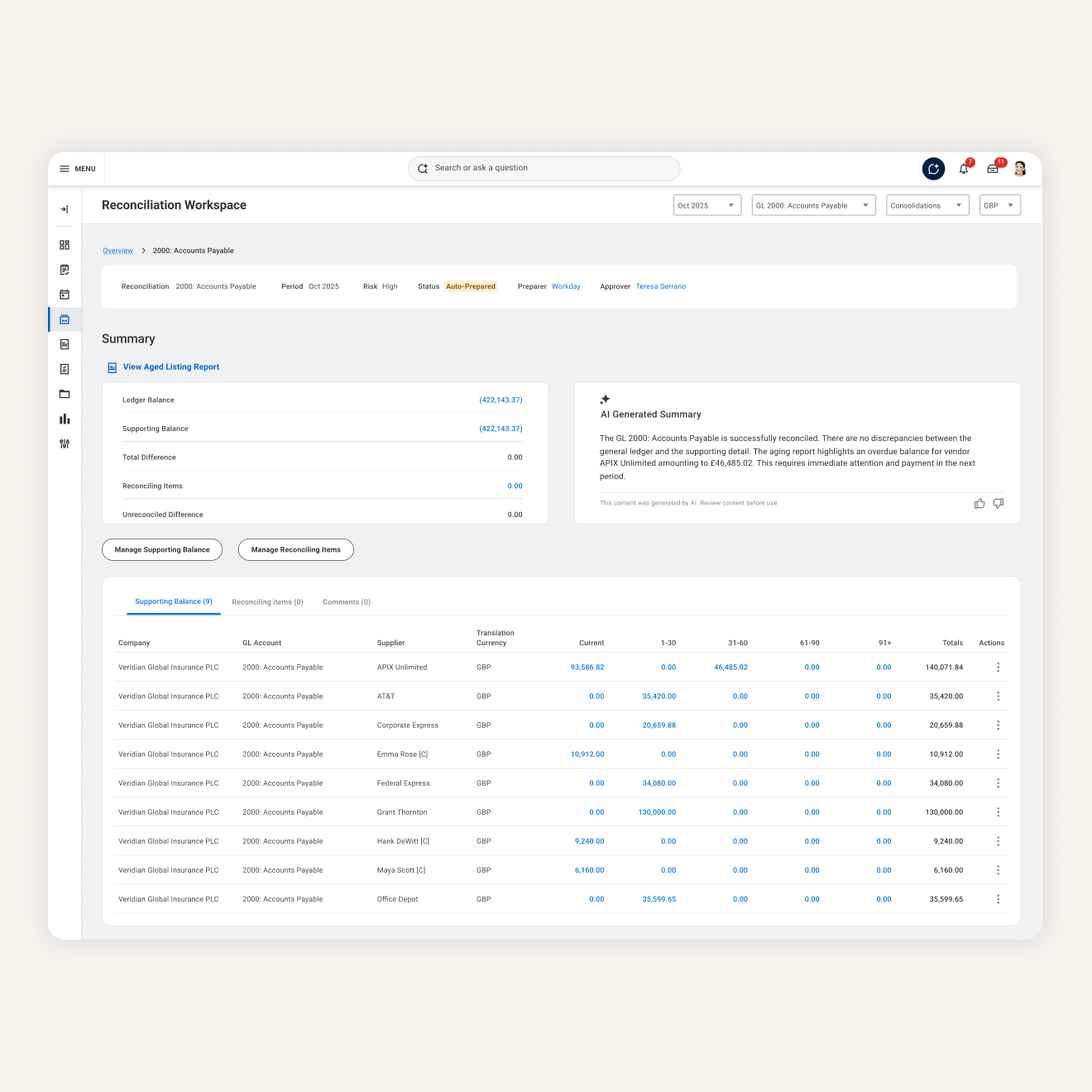
Rebuilding how finance teams prove their numbers add up
Every month, finance teams have to prove their records match what actually happened with the money. When it doesn't, someone has to work out why. I led the redesign of Workday's reconciliation product so that the whole process lives in one place, and automation does much of the heavy lifting. Partway through, we found we couldn't build our designs with Workday's tools, so I made the business case that changed how engineering approached it.
The impact
The new hub has reduced manual reconciliation time by 80+ hours per month for enterprise finance teams.
Our demo at Workday Rising received an audience score of 4.92/5, incredibly high for a Financials session.
The strategy shift I drove is now unblocking other teams' roadmaps.
The problem
Reconciliation is a truth test: does the story the system tells match the money that actually moved. At most companies this breaks down because the data lives in different systems, spreadsheets, and email threads, so teams end up manually copying balances and chasing sign-offs with no visibility into what's done, pending, or stuck. Our legacy solution was losing on this exact point. Sales data showed reconciliation gaps had caused 45 deal risks or losses in a single year, and customers told us directly that our interface felt dated next to competitors.
We couldn't build what users needed with the tools we had
The vision was multi-year, so I ran a 3-day workshop with Product and Engineering to cut it down to a 6 month MVP. Then we started wireframing, mapping every screen to Workday's native component library, and hit two problems fast. The library was built for HR, so financial patterns like vertical calculation grids didn’t exist. And some components we needed couldn't work together due to interoperability limits. We faced a choice: dilute the experience to fit the tool, or push for the necessary tech stack.
I'd been logging every friction point in a running document as we went. It started as a simple list, but it showed we were burning engineering time on workarounds that still left users with a compromised product. So I rebuilt it into a business case, with an executive summary that turned the technical limits into what leadership cares about: lost deals and revenue risk. It went up the executive chain and won approval for a hybrid approach, using React for the mission-critical financial patterns, like the vertical calculation grid the native library didn't have.
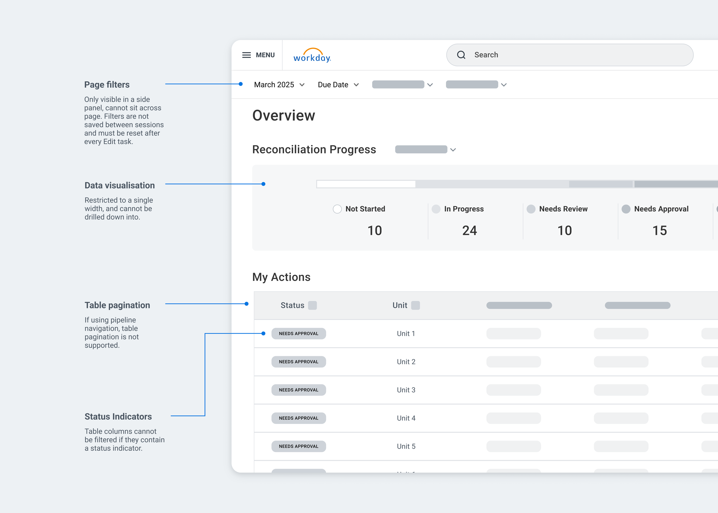
Early wireframe with documented tech constraints
The experience gaps document submitted to leadership
AI does the setup, but shows its work every step of the way
Our early research indicated initial setup was a big barrier to adoption, with one user calling it a "constant headache" and another saying they wouldn't go live without AI-assisted setup. So we built a flow where you upload your existing reconciliation definitions and the system maps them for you. Every column gets a status: Mapped, Needs Review, Missing or Not Provided. Anything the AI couldn't confidently match is left for the user to complete rather than guessed at.
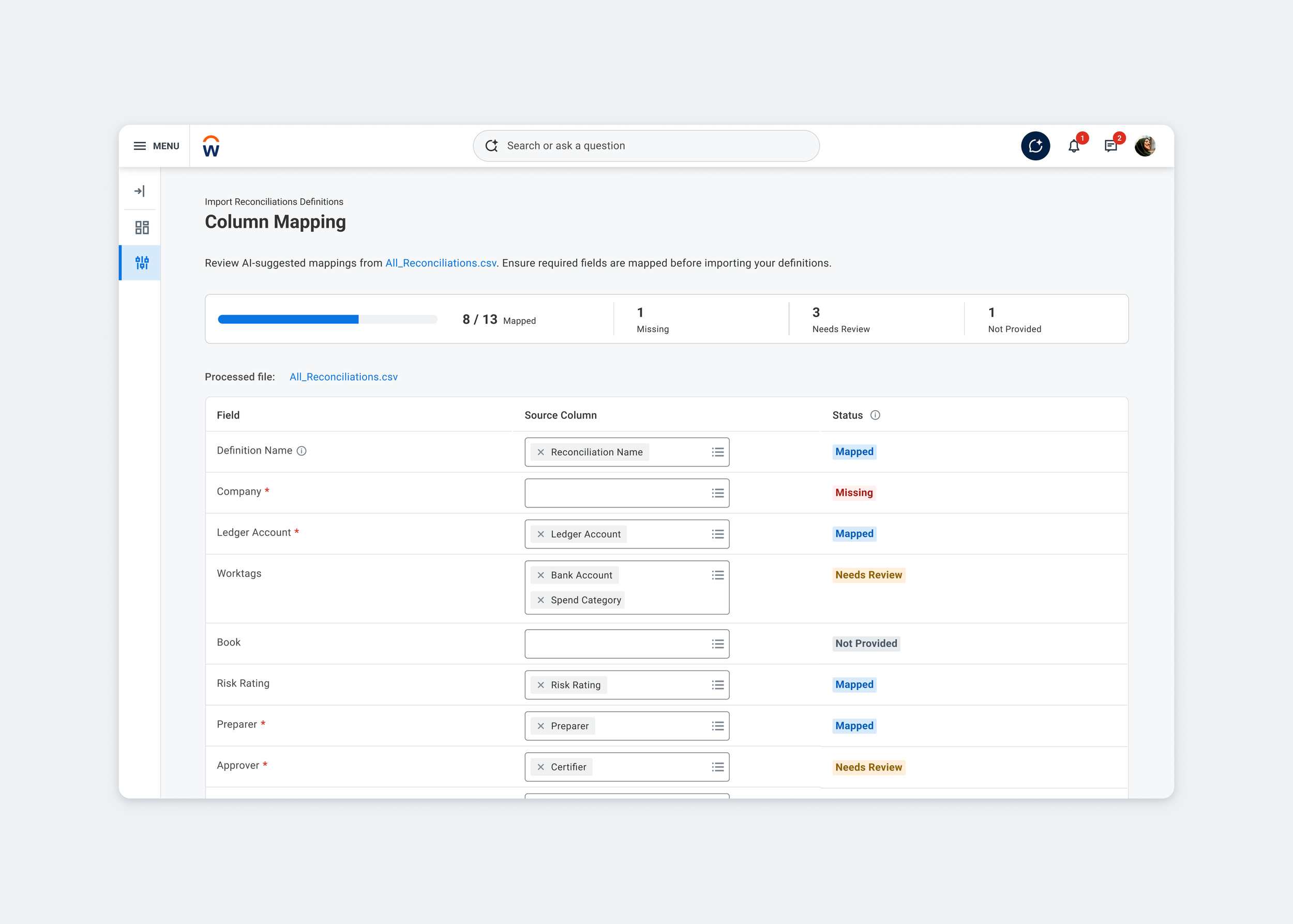
AI assisted configuration
Testing overturned my assumptions
Managers described their current process as chasing spreadsheets and Slack messages, with no visibility into where a reconciliation was stuck. Recognising this, we built a centralised Reconciliation Hub. My assumption going in was that a card-based layout would be more scannable and reduce cognitive load. I designed two directions to test that assumption, the card-based overview and a dense table. The table won decisively, with one participant calling it "instantly easier to read" than the card layout.
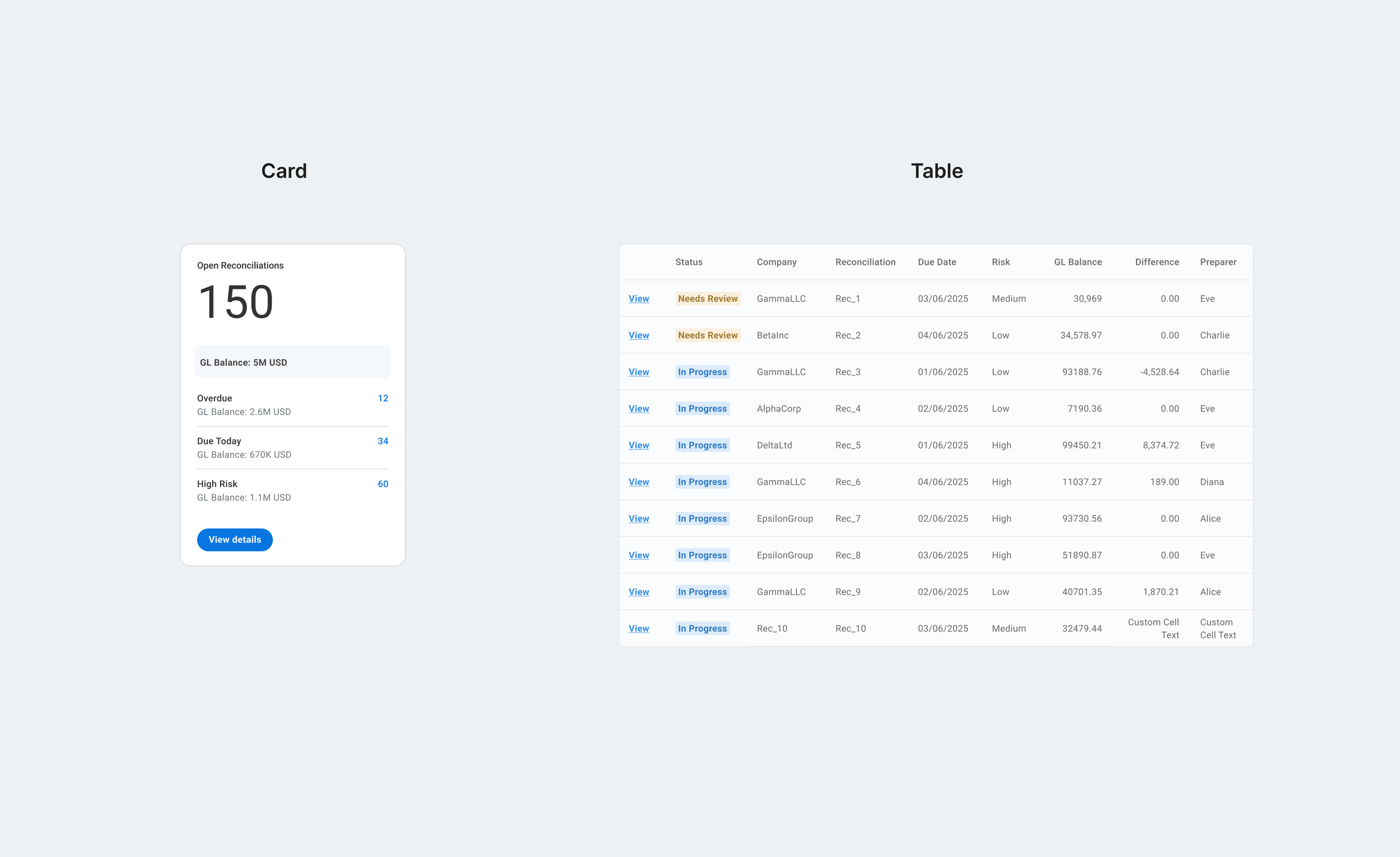
The new card component, and the table I tested it against.
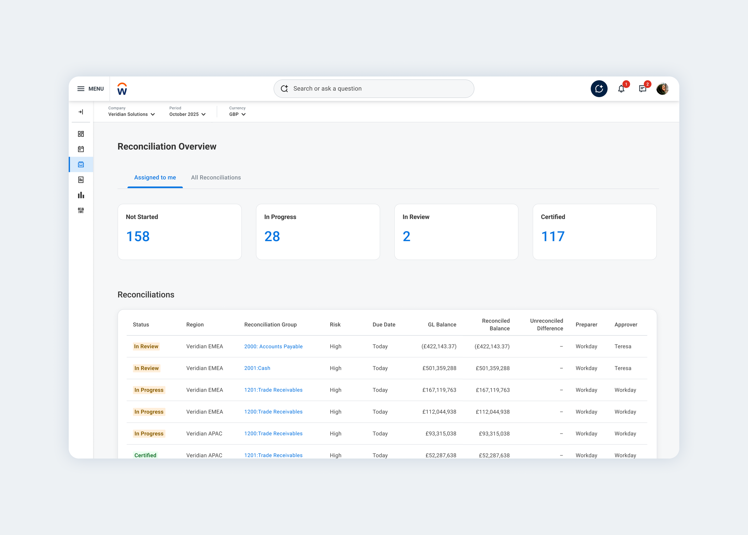
The Reconciliation Hub: what's due, in progress and auto-certified at a glance, above a dense table of every reconciliation.
The status problem nobody had defined
That same testing surfaced a separate problem: people couldn't tell "in progress" from "awaiting approval," and had no way to see unassigned work before month end. I simplified the statuses and put unassigned tasks up front instead of burying them in a report.
Untangling that exposed something bigger. Workday's design system had no real definition of what each status colour meant, so different teams were using the same colours to mean different things. A Principal PM had flagged the same gap separately, so we built a shared framework together, and it's now the standard across Workday Financials.
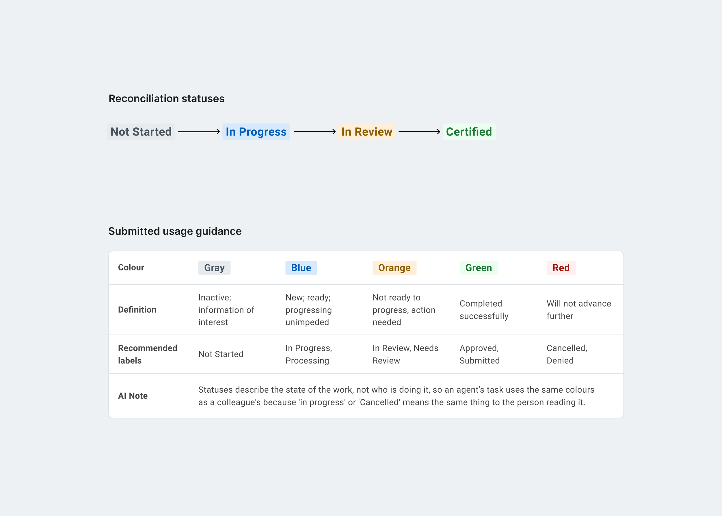
The status colour framework I built with a Principal PM, now the standard across Workday Financials.
Learnings
Find the technical ceiling early
Subjective arguments about "good UX" rarely win against hard engineering constraints. Mapping our wireframes to the existing component library early, exposed the technical ceiling while it was still cheap to address. Using this evidence and framing it sound lost deals and revenue risk, created a compelling business case that actually moved leadership to authorise a new tech stack.
Test the assumption, not just the solution
Across this project the same pattern repeated: I started with a strong point of view, whether AI should handle configuration, whether cards or grids read faster, whether less is more, and then tested it properly before treating it as settled. More than once the evidence pushed back on my first instinct, and each time the resulting design was stronger for it.